Have your Product photos stand out on ETSY

You’re an established or fledgling online shop owner. You have worked hard designing and making a product (or products!) and the feedback is positive!
Selling online on a marketplace like Etsy means you’re very likely competing with hundreds of other similar products. It sucks but it’s not a setback. It just means you have to bring your “A” game when it comes to your product images.
So here are some helpful tips that immediately will guarantee better sales. Really!
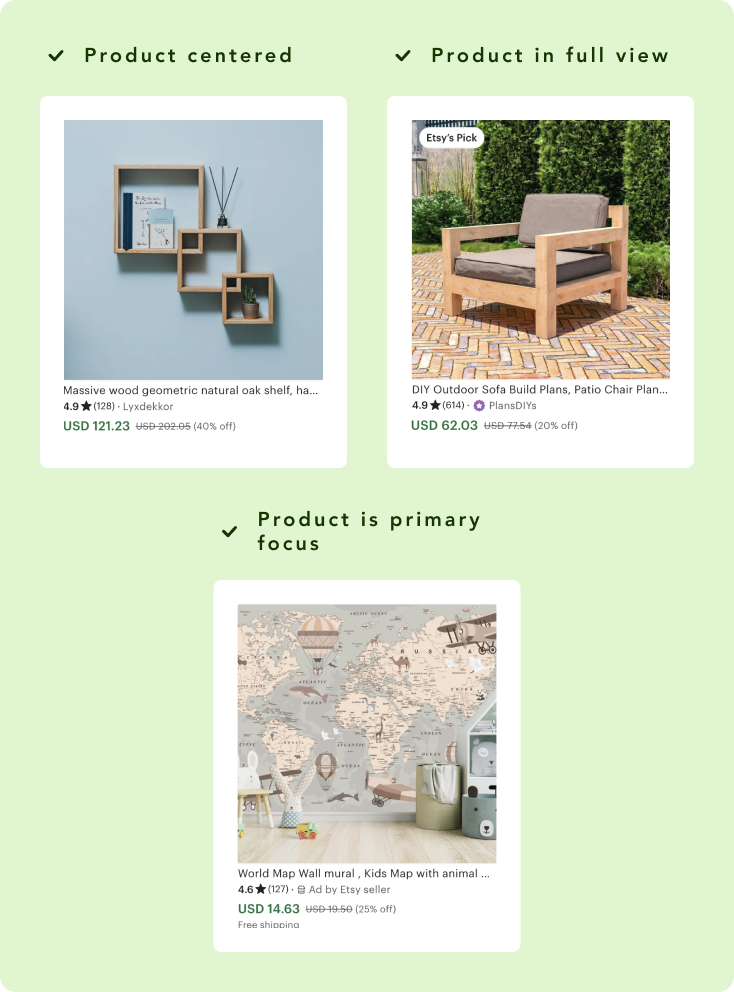
Show the product in full
The first product image, the one that’s going to be the main thumbnail, needs to show the product in full view. This means from top to bottom, left and right.
Showing it in full view gives it a professional look and easy “window shopping” experience.
- Center perfectly the product in the middle of the screen.
- Make sure you’ve got decent padding from the border of your image. It’s gonna give it a nice “framing” feel to it
- Make sure your product is the main focus of the Product image
- Closeup are great to showcase details and craftsmanship but not for the primary product image (more on this later)
Below some examples of what you should avoid and what you should look for when preparing your product images.

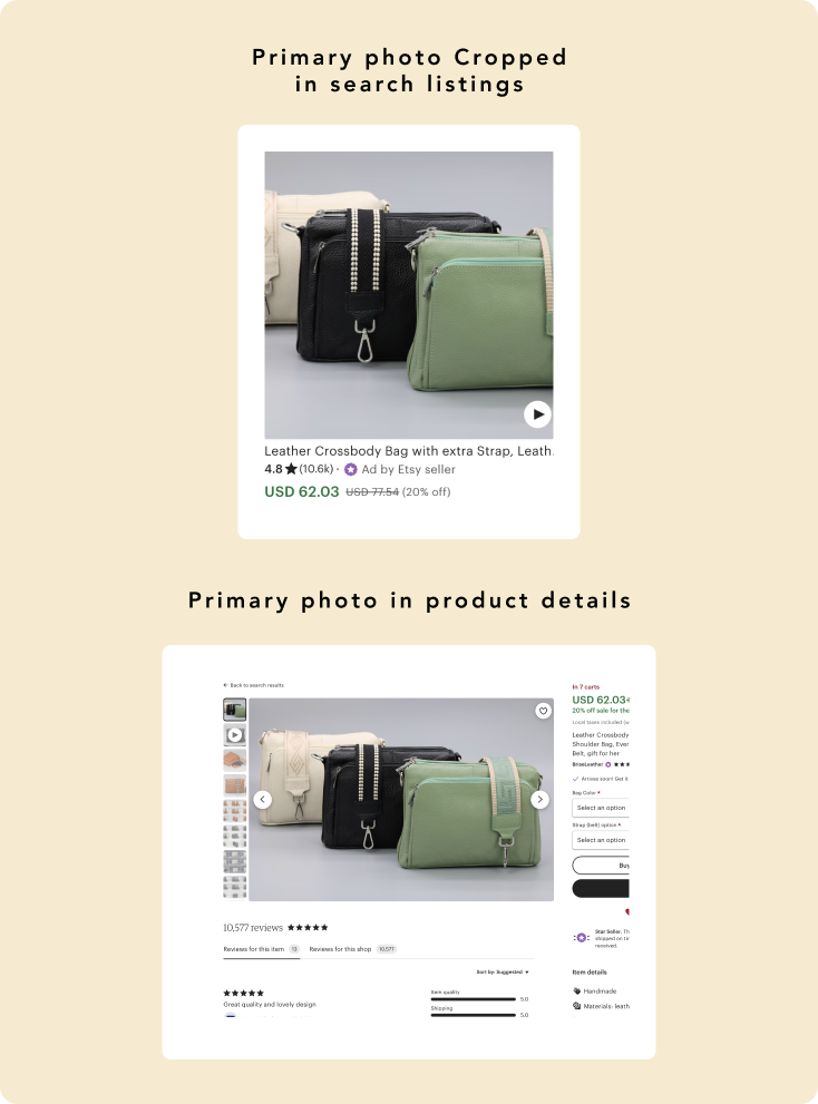
Now one thing to take note that’s important because it relates to Etsy’s Photo size requirements.
The first photo you upload to the your product listing will be tagged as Primary (The main photo of your product listing). Etsy automatically crop that primary product photo to fit in a square view.
You can add any type of photo (Landscape, Portrait, custom) but if your product is not properly in the center and middle it may get intentionally cropped to be square when viewed in the Product listings.
See what happened to this listing:
Minimal text or none at all
Adding text to your first product image should only be if you really, really need to. You can check your competitors’ product images, see if they add text and what it relates too, and see if it applies to you.
If you will add text:
- Make it short and to the point. Think carefully what you really you want to get through the buyer so they will click the listing that your image isn’t able to address
- The text has to be legible and easy to read
- Make sure the design of the text and where you position it enhances your Product image
If you’re not sure you need to add text? Wait and see if you need to. Right now your image has to stand on its own and you shouldn’t have to rely on text unless its absolutely critical.

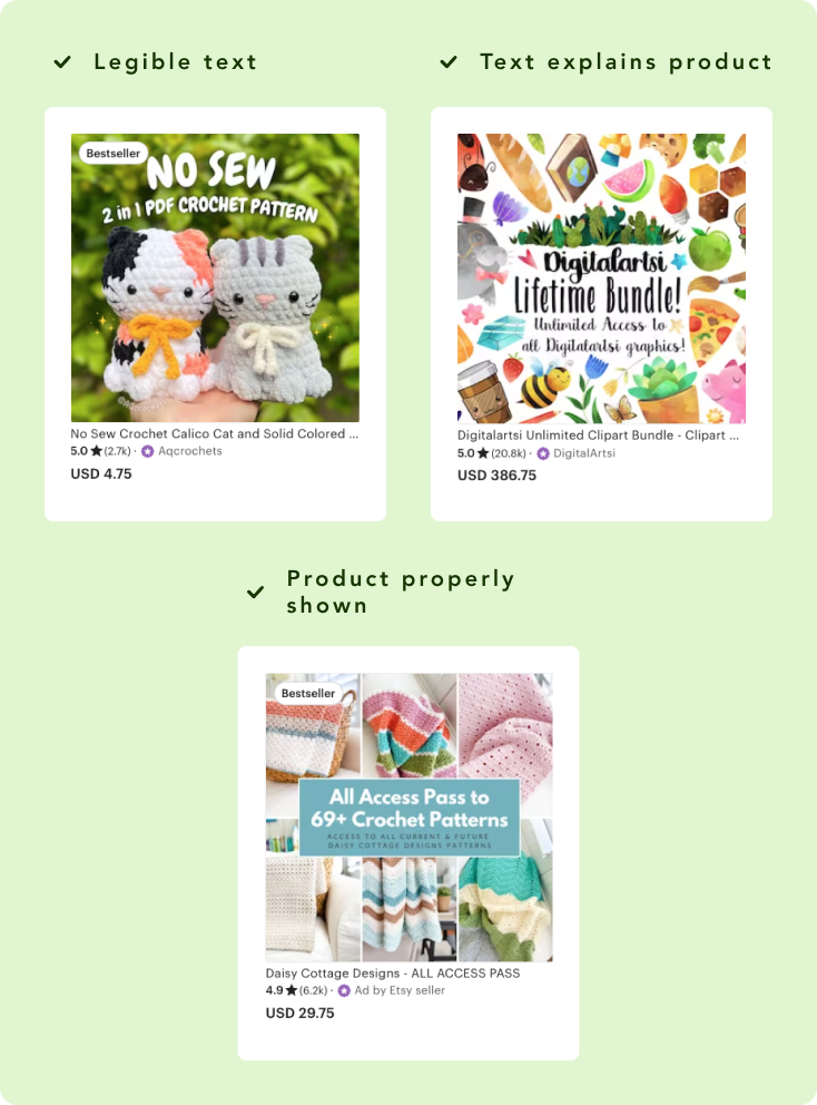
And a quick reminder about your first product image: your text will also get cropped if you aren’t careful! Keep you text within a square area based on the center & middle of your image dimensions you have (portrait/landscape, custom).
See the difference? Two listings side by side. Which one would you click?

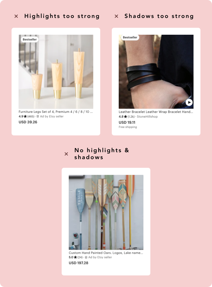
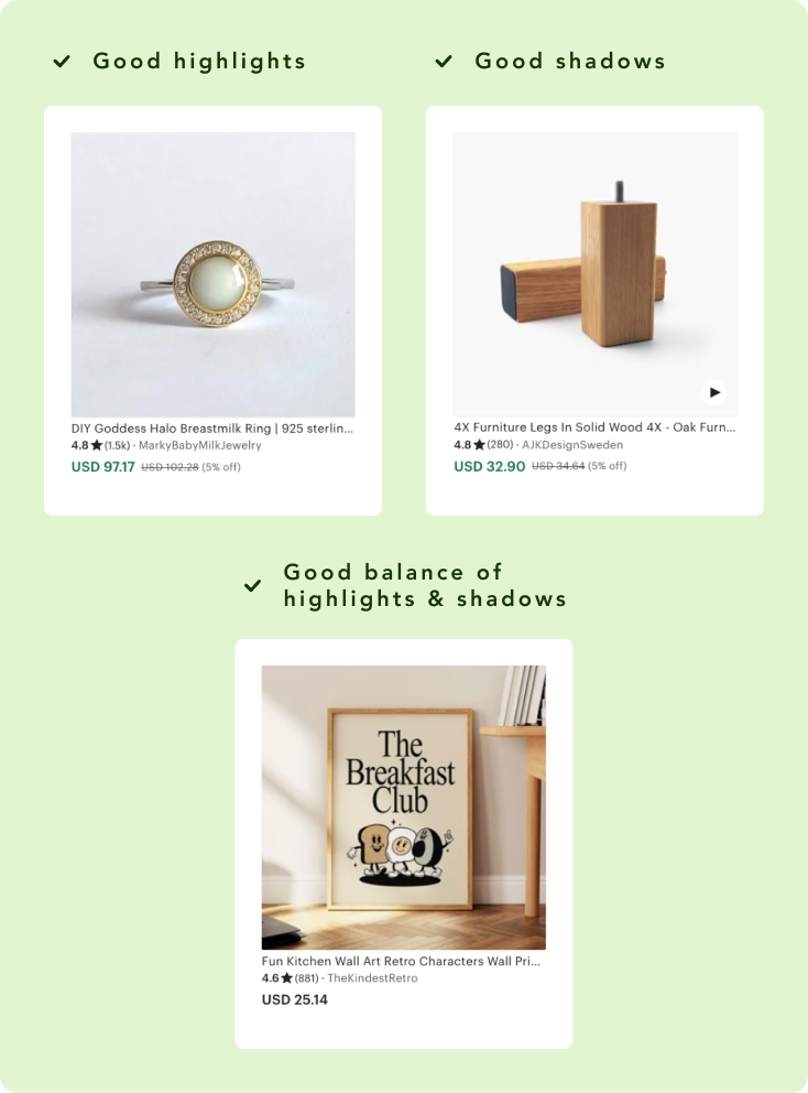
Use light and shadow moderately
Strong bright and dark areas in a photo can be great for setting a mood and style but it shouldn’t be your primary goal.
Showcase the details of authenticity of your product by using moderate and softer highlights and shadows.
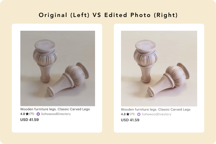
The good thing is you can edit and improve this at the photo editing process. More on that later down.
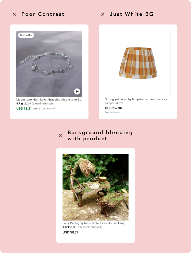
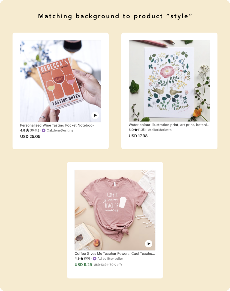
Product Image Background
Your Product’s Image Background can set the theme you want to portray but most importantly help your product stand out from all those other listings.
The trick? Make sure you have a clear contrast between the product and the background. If it feels like your product seems to blend TOO much with your background it might get lost when a buyer is browsing through hundreds of other listings.
There are many ways you can avoid this:
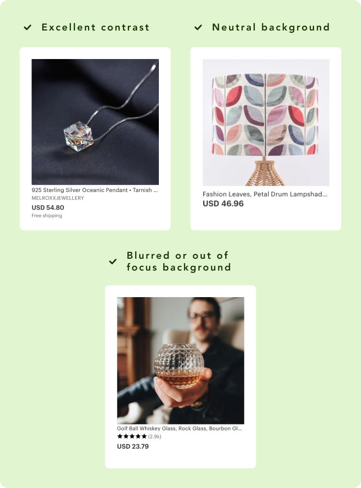
- Contrast. Pick a Background thats going to highlight or complement your product’s color palette
- Have your Background be out of focus or blurred out. Just make sure your product’s details are sharp and it will naturally draw the buyer’s eye to it
- Give your image background a minimalistic approach. Having a plain, more neutral light background will guarantee the product is the main focus. Just, don’t go full white 🙂
If your product has a clear niche or theme to it then having a matching Background that fits with your product will accentuate it more. You don’t need to go overboard though! You want to just push the vive your product is already giving out.
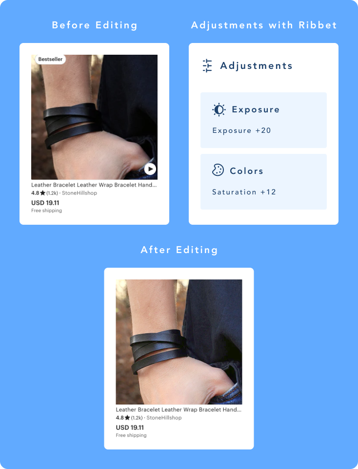
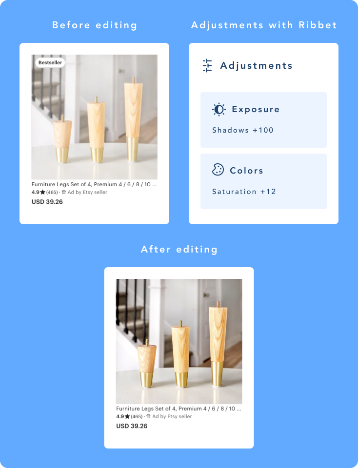
Editing your product images
You don’t need photoshop! Ribbet has available some FREE tools to edit and adjust your product images quickly for all the points above.
- Resize. These days your photos will come out in high resolution but this won’t match up with Etsy’s requirements for product image resolutions.
- Cropping. Same as Resizing, you’ll most likely need to crop your images to meet Etsy’s requirement for product image dimensions
- Image Adjustments. Adjusting your photo’s contrast, brightness, highlights, and more will help you with minimising strong highlights and shadows. Even being able to adjust the saturation of your image can help make your product a bit more vibrant.
- Rotate/Straighten. Maybe you used a tripod but if your product seems a bit off you can straighten it out in a pinch.
Parting words
I hope this was helpful! Just keep in mind these are guidelines to follow and not rules. Begin by applying these guidelines, see the results, and make the necessary adjustments that work for you.
Got feedback? Questions? Leave your feedback below and happy editing!

This was excellent! Every point covered was important, with #1 being the critical details about taking an effective first shot, as it’ll end up as a thumbnail on the search-results page. (Who knew?) Then at the end you returned to some unedited examples, and showed before-and-afters with the specific Ribbet adjustments that fixed them. That was terrific. (A bit of noise for Ribbet to boot!)